

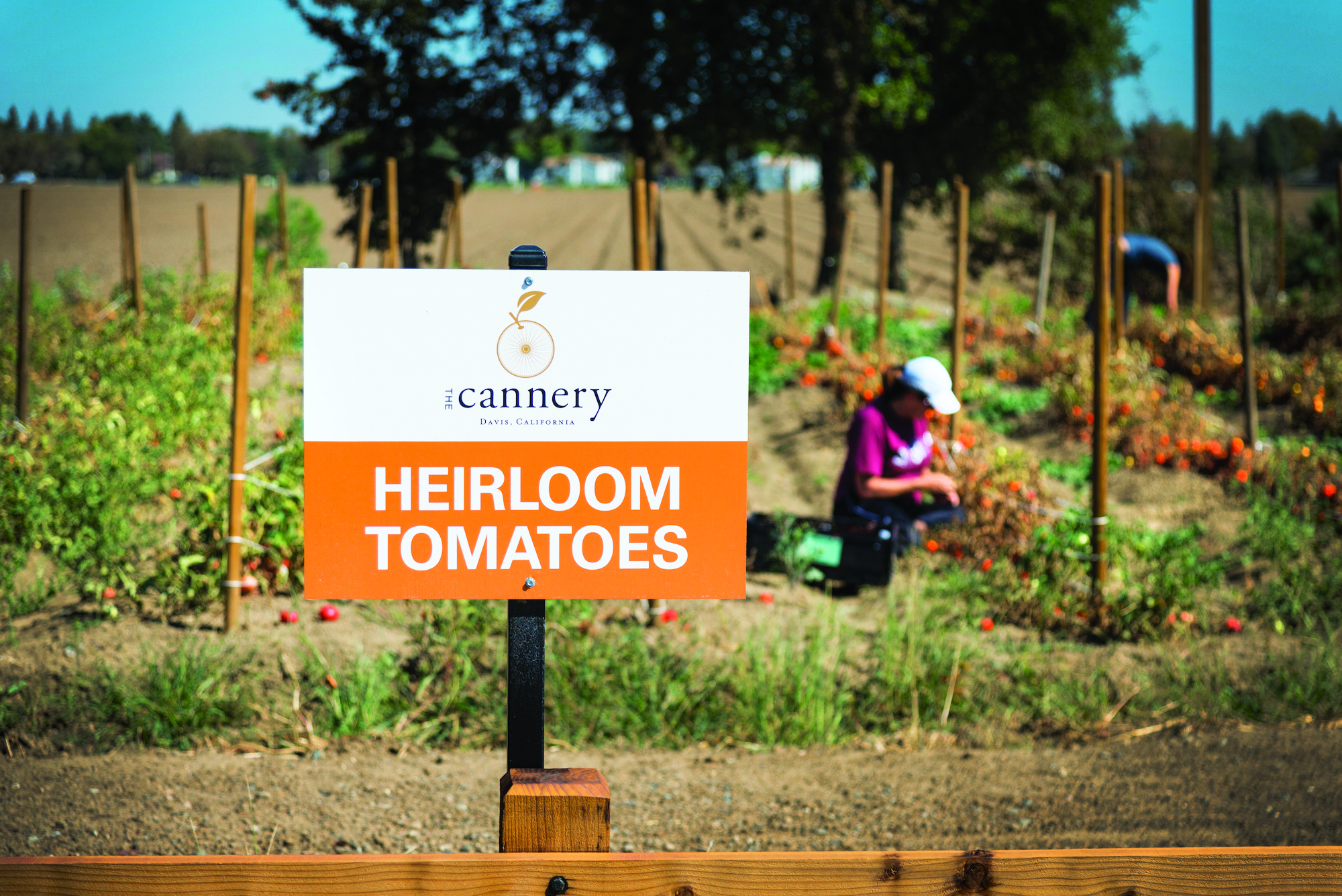
The cannery in Davis, Calif., was chosen as master planned community of the year. A farm-to-table focus is evident throughout its marketing. (Photo: Peter Cooper)
During the downturn, many builder marketers found themselves fighting hard for the few buyers who were in the market. Today, it’s the opposite: With housing on more solid footing in some areas, competition is about grabbing the attention of the buyers in those markets rebounding with new development. Standing head and shoulders above the rest are the winners of the 2016 National Sales & Marketing Awards, with programs and campaigns that offer fresh approaches, new inspiration, clean designs, and modern takes on traditional ideas.
The 2016 Community of the Year, The Cannery, in Davis, Calif., sets a high bar. The farm-to-table master planned community focuses on all things local, with a branding campaign that resonates with potential buyers and hews to The Cannery’s agriculturally oriented location. In Toronto, the Art Shoppe Lofts + Condos was equally in tune with its target audiences, tapping the fashion industry for design and marketing support. In Atlanta, Ashton Woods’ global inspiration set the tone for an elegant, engaging advertising campaign.
The following collection of this year’s winners presents an array of ideas from which every marketer—regardless of type or geography or budget—can draw inspiration.
BEST MASTER PLANNED COMMUNITY: THE CANNERY
The Cannery capitalizes on the agricultural heritage of Davis and its status as foodie epicenter.
Signature Sustainability
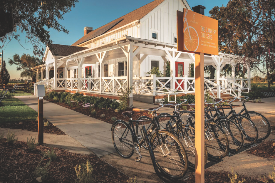
The Cannery, in Davis, Calif., developed by The New Home Company, claims to be California’s first true farm-to-table master planned community, reflecting a growing trend around the country toward more self-sustaining, locally attuned living. The project will feature 547 residences, a rec center, a welcome center, public parks, biking trails, and retail/office space. But the usual similarities to other MPCs end there. Highlights also include a 5,800-square-foot working barn and a 7.4-acre sustainable urban farm from which residents and nearby neighbors can buy community-grown fruits and vegetables.
The approach is well-suited to the agricultural hub of Davis, which leans toward the healthy and sustainable and is considered the most bicycle-friendly town in the U.S. The Cannery is situated on the former site of the Hunt-Wesson tomato canning plant, near downtown Davis. Its recreation center, pool, and outdoor amphitheater are centrally located for easy access from all neighborhoods, while a network of trails ensures that any destination within the community is no more than a 10-minute walk or 5-minute bike ride away.
Davis, Calif., is widely seen by many as one of the most bicycle-friendly towns in America (Photo: Christopher Mayer).
A diversity of home options, built by The New Home Company, Shea Homes, and CalAtlantic Homes, includes flats, rowhouses, cottages, and bungalows. Each offers energy-efficient elements including pre-wiring for solar power, cool roof-rated roofing materials, and ducts enclosed in conditioned space or high-performance attics. Single-family options are prewired for electric vehicle charging; multifamily and mixed-use areas have charging stations. Turf reduction, smart irrigation controllers, and low-flow fixtures are part of the communitywide effort for water conservation. All houses include design that’s flexible for different generations: stepless entries, ground-floor bedrooms and bathrooms, reinforced towel bars, wider doors, and multi-height work surfaces. Some incorporate multigen guest houses or private quarters.
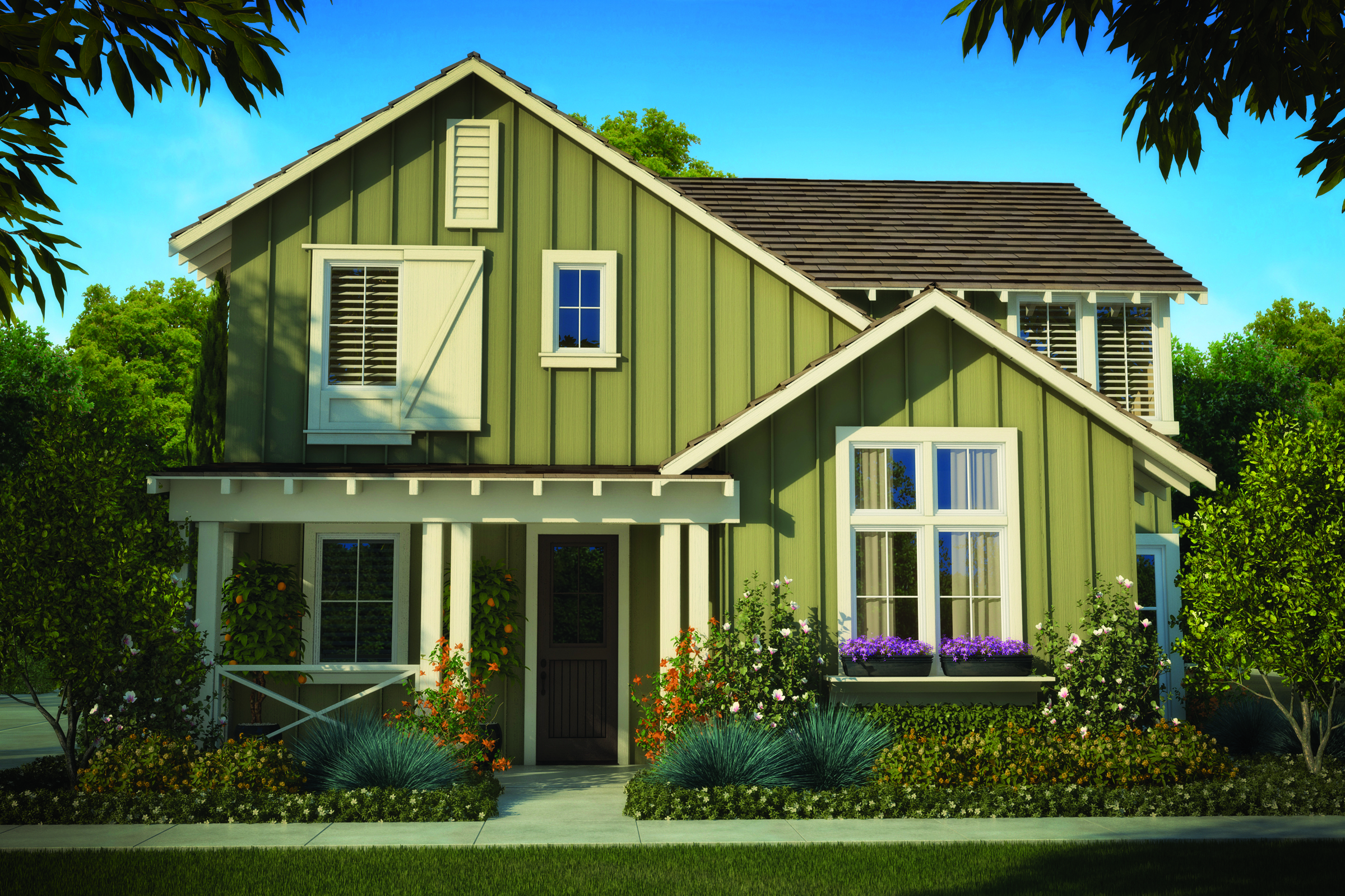
The Cannery features a diversity of homes that pay homage to rural northern California's architectural heritage (Rendering: Courtesy Cannery).
Further fostering the community feel, many of the plans feature covered front porches, courtyards, or balconies. Every home is within 300 feet of a park or trail, and ample bike storage space can be found in homes and around communal amenities.
Old Ideas Made New
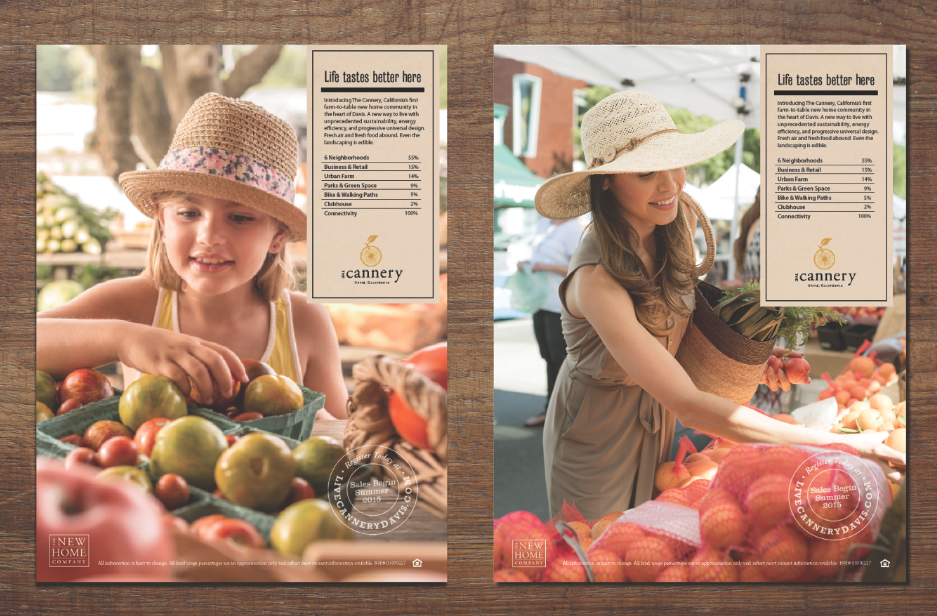
Sustainability and agriculture are ever-present throughout The Cannery’s marketing materials. “The overall objective of the branding materials for The Cannery was to honor the agricultural legacy of both the property and the City of Davis, which is recognized as an epicenter of agricultural innovation,” says Daniel Martin, senior partner of Paolucci Salling & Martin Communication Arts. “At the heart of all efforts was the desire to maintain a focus on authenticity around the areas’ agricultural roots, green and sustainable living, and commitment to biking and outdoor wellness.” The Cannery’s logo features a bike wheel accompanied by a stem and leaf, a nod to the high-wheel bike in the logo for Davis, as well as a reference to the community’s farm-to-table ethos. “Although the logo is rooted in historic elements, the design used a palette that also provided a fresh and contemporary take on this classic Davis lifestyle,” Martin notes. The font casing and a rotated “the” acknowledge The New Home Company’s own branding.
Simple Signage
Alluding to earthy origins, model and wayfinding signs are constructed of natural wood, and an entrance monument and barn logo are made of aged Cor-Ten steel. The overall effect is rustic-modern with a feel for the personality of the community. “What is old becomes new again,” Martin says. “Living close to a farming community where the food is grown locally and the community encourages outdoor living has been the approach to planning some of the most admired communities in the world.” The Cannery brand is also taking shape through events such as a pumpkin carving festival this past fall (using pumpkins harvested from the urban farm), and a 5K race that will take place this spring along the community’s loop trail. These serve to draw prospective buyers in to a community that feels in sync with the land and with the City of Davis. As one of The Cannery’s primary taglines puts it, “Life tastes better here.”
The Cannery’s 7-acre urban farm is managed by the Center for Land-Based Learning and is being used as an extension of the California Farm Academy training program. (Photo: Peter Cooper)
BEST OVERALL AD CAMPAIGN: ASHTON WOODS
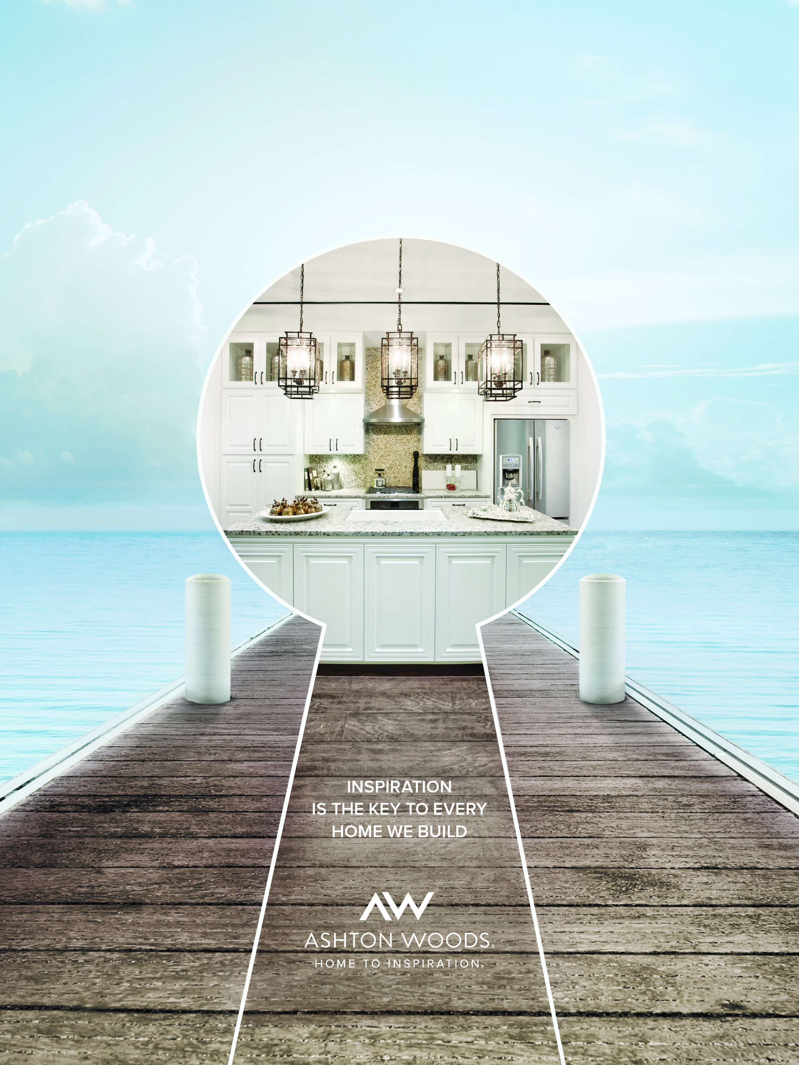
Conveying to buyers that you understand what they’re seeking—and what inspires them to seek it—is a tricky challenge that Ashton Woods conquered.
Offering Luxury—and Differentiating It
While Ashton Woods makes its headquarters in Atlanta, the design inspiration for its luxury homes spans the globe, drawn from the spires of a French cathedral to the grand redwoods of Northern California, and beyond. The challenge: How to express that vast inspiration in a 2-D ad campaign? “The key to inspired homes can often come from outside the world of home building. It’s what enables us to go where no home builder has gone before,” says Michael Ianzito, director of marketing communications.
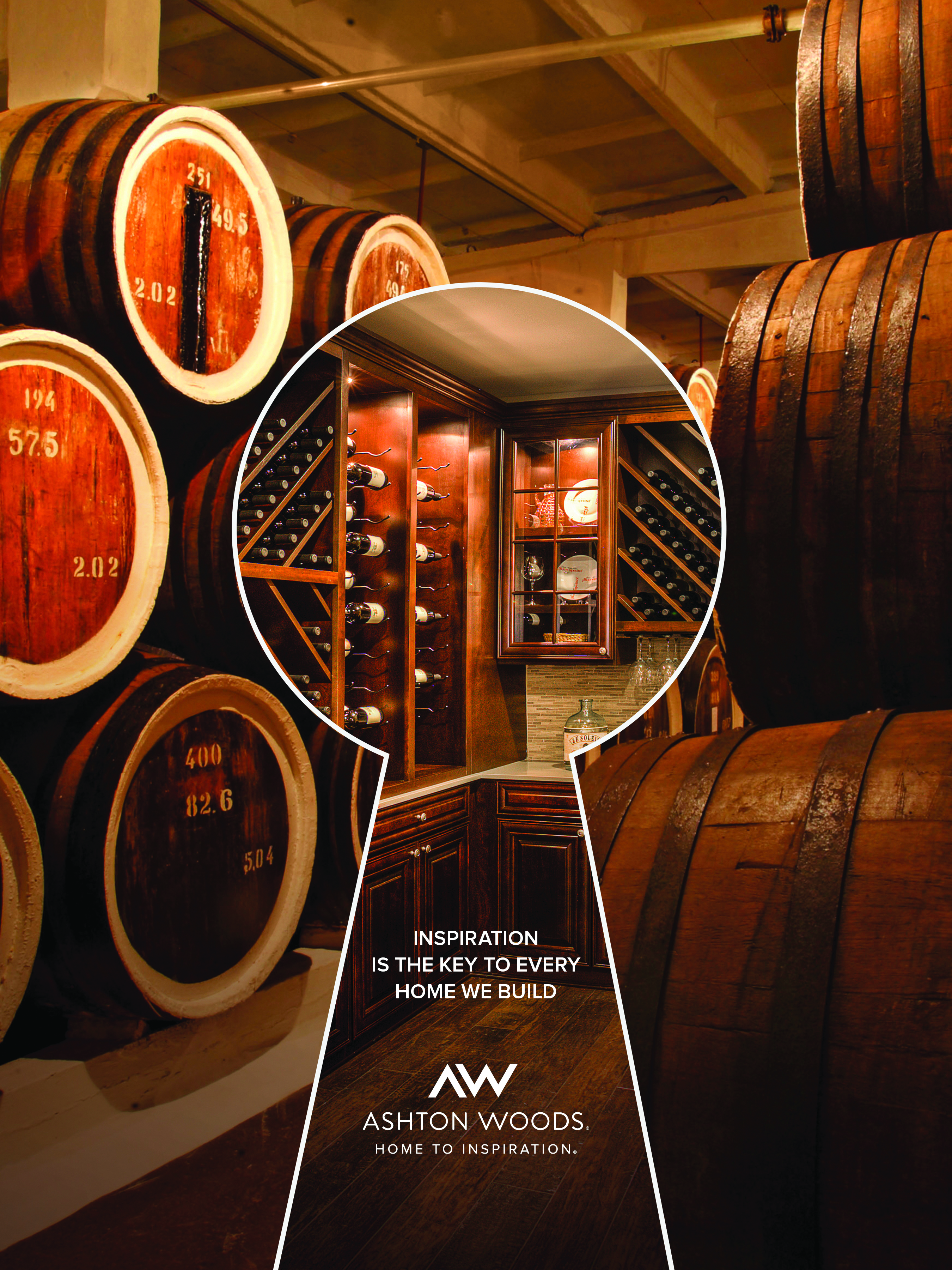
The builder devised a series of ads that give audiences a peek into the core of its design philosophy. Each depicts a source of Ashton Woods’ inspiration flowing into a keyhole that reveals the resulting design: The sculpted ceiling of the iconic Arc de Triomphe, in Paris, gives way to the neoclassical interior it inspired; aged oak casks of a cellar turn into a wine room. A local ad shows how Atlanta’s High Museum inspired one of Ashton Woods’ kitchen designs. The accompanying message, “Inspiration is the key to every home we build,” ties the campaign together while summarizing its objectives. Online banner ads carry the same theme and artwork via animation. The campaign succeeds in stressing the builder’s focus on exceptional design, and it communicates the inspiration essential to its mission. “It’s visually arresting. It’s fun. It has longevity. And, like our homes themselves, the possibilities are endless,” Ianzito says.
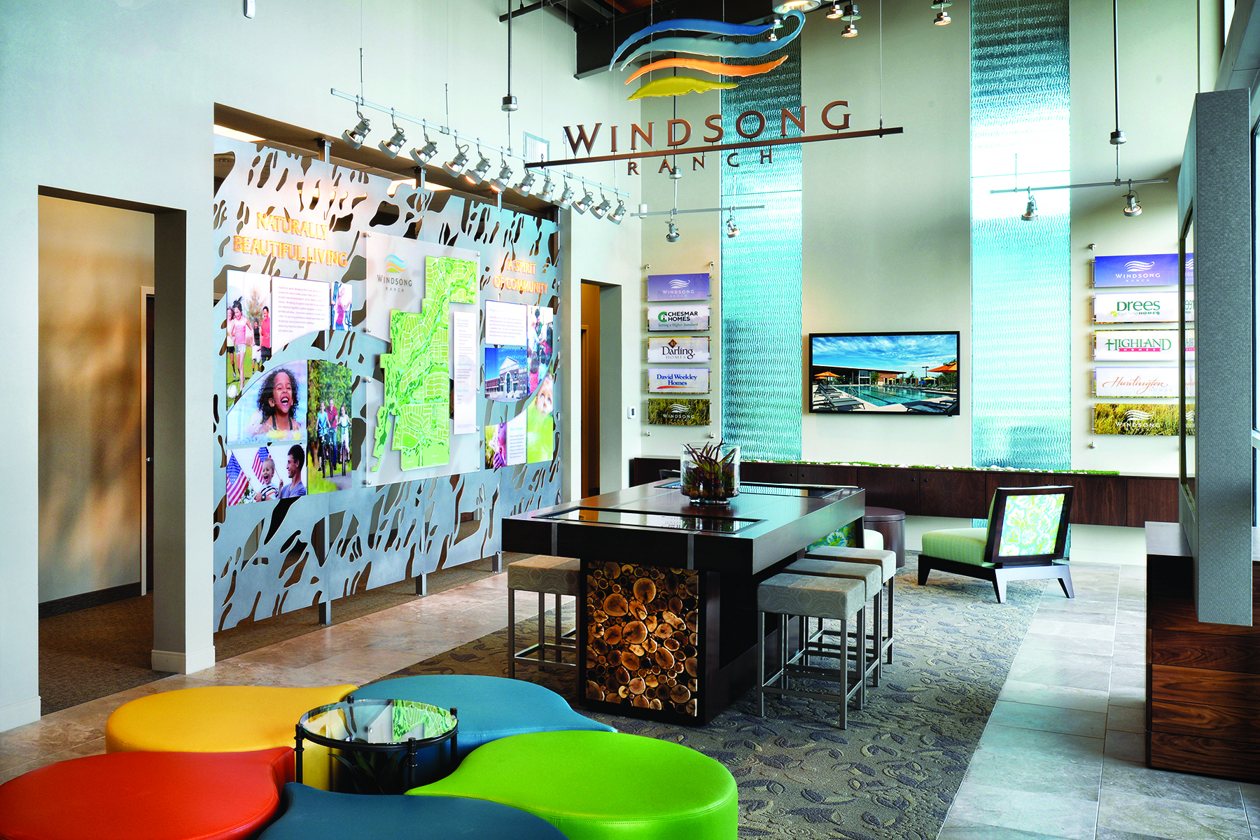
BEST SALES / WELCOME CENTER: WINDSONG RANCH
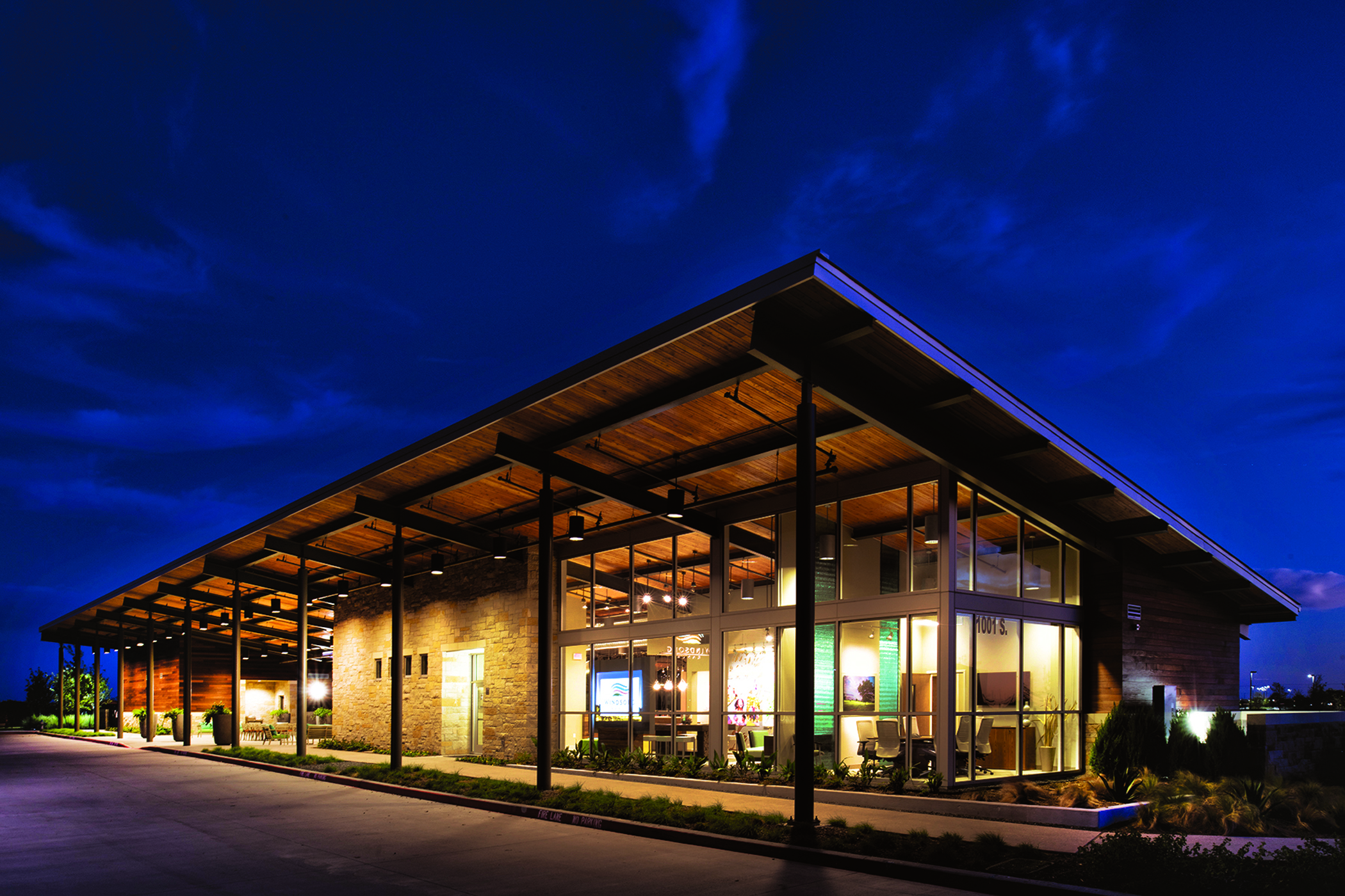
Windsong ranch uses a rural-modern welcome center to tempt buyers and give them a taste of what life is like there. (Photo: Jim Wilson)
The Art of the Soft Sell
Like many master planned communities across Texas, Windsong Ranch pays homage to the roots of its land and location in its name. But when it came to designing the community’s welcome center, Creative License International decided to eschew the typical ranch styling, rusted earth tones, and Lone Star themes, setting itself apart with more vibrant colors and a modern approach. The design team played off of the branding work of agency Anderson Hanson Blanton, taking cues from the colors and lines of the community’s logo: The center’s walls and pierce-cut metal display panels evoke the windswept fields of Texas. Locally harvested tree rounds, turf, and river rock, along with exposed wood ceilings, summon the outdoors while glass walls beckon visitors outside. The effect is compelling.
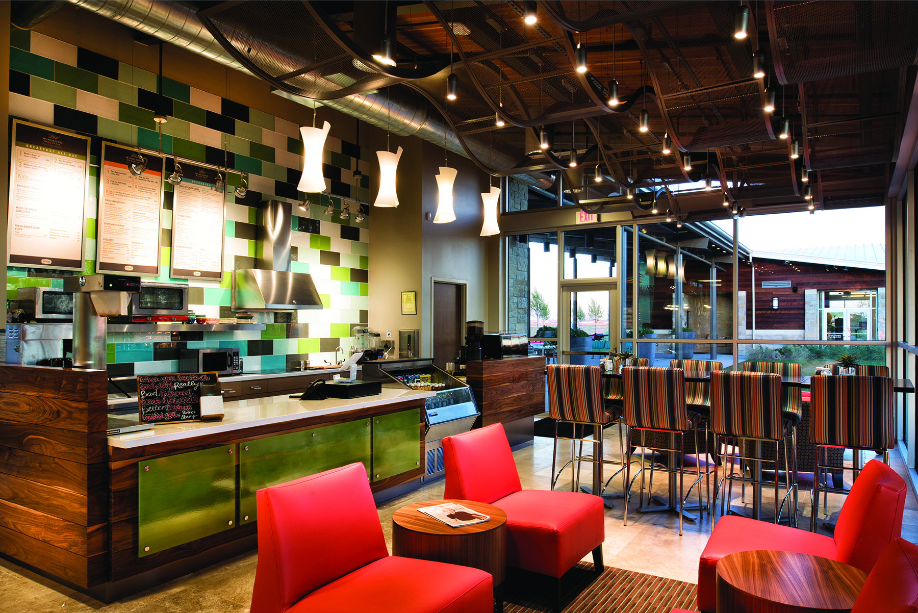
An appealing coffee and sandwich bar supports a soft-sell strategy. (Photo: Jim Wilson)
“The purpose of a welcome center is to sell the community, the location, the amenities,” says Claudia Gerster, owner and president of Creative License International, which designed the center. “Our goal is for a visitor to say, ‘I want to live here.’” That mission is accomplished in the center’s design vibe and in its complete integration with Windsong Ranch itself. The welcome center connects to the community’s coffee and sandwich bar, which then spills over to the fitness center and pool. “When visitors come in, they’re in the lifestyle because they’re in the amenity,” Gerster says.
Windsong Ranch's sales center has a approach that's upbeat and community-focused. (Photo: Jim Wilson)
The welcome center is designed for a soft sell. Potential buyers can relax with a drink and experience life as a homeowner. The sales agent, whose desk is pushed back from the entrance, acts more as a community rep. Visitors can take a guided or self-guided tour, starting at a community table with embedded monitors to explore the different builders, products, and locations. All of the models are within walking distance, allowing the visitor’s desired pace to easily continue—and the true experience of life at Windsong Ranch to linger.
BEST GRAPHIC CONTINUITY: EAST UNITED CONDOS
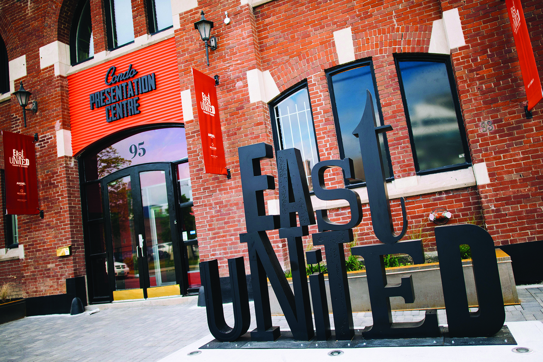
East United Condos plays up its urban setting: A diverse and artistic neighborhood in downtown Toronto. (Photos: courtesy Signature Communities)
Leveraging Local Pride
One glance at the East United condo building in Toronto makes it clear that these are no ordinary living spaces. The metal-and-glass building is set on a historical brick structure, extending above it in a series of stair-stepping rectangular forms. Unique amenities within include a workshop, a pet spa, wellness zone, jam room, and rooftop terrace. It’s a fitting mix for an East End neighborhood that prides itself on a diverse population and varied architecture. The project’s extensive marketing programs emulate that diversity. “Everything was about being eclectic, artsy, and original,” says Rob Galletta, managing partner of advertising agency Blackjet. “We wanted that to permeate all touchpoints and aspects of the branding.” The approach can be seen in the logo, in which each letter uses a different font, designed to stand out in a variety of media, from a 10-foot iron sculpture outside the presentation center to the website to the collateral materials. A consistent color palette of black, cream, and orange earth tones is present across all platforms.
Elements of the marketing campaign tap into the East End’s pride in its grittiness and artistic roots as compared to Toronto’s trendy West End. Branded key chains, mugs, and T-shirts telegraph the community’s anti-hipster attitude with slogans such as “I prefer independent coffee shops,” “I ride a bike because it’s smart, not popular,” and “You drink craft beer because it’s better, not trendy.” Leveraging good-natured rivalry, an Instagram contest challenged community members to infiltrate the West End and plant East United flags.
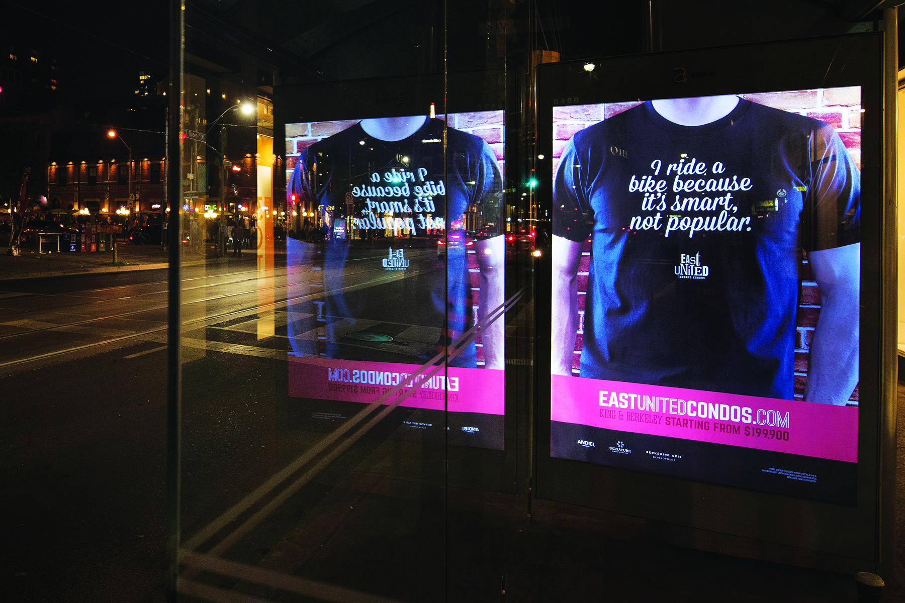
East United t-shirts play up local pride in a city known for good-hearted neighborhood rivalry.
In the presentation center, the model suite is partially constructed in wireframe and traced in light, helping buyers to envision a home. Finish options are organized by neighborhood personality—Artist, Foodie, and Sleek Business. The blending of historical and modern can be seen throughout, from an availability board mounted on antique doors to a pop-up shop. In graphical design and execution, the team evoked an exciting vibe without coming off as overwrought. Despite Toronto’s overcrowded condo market, all 300 units sold out in five months prior to construction breaking ground.
BEST DESIGN CENTER: EDWARD ANDREWS
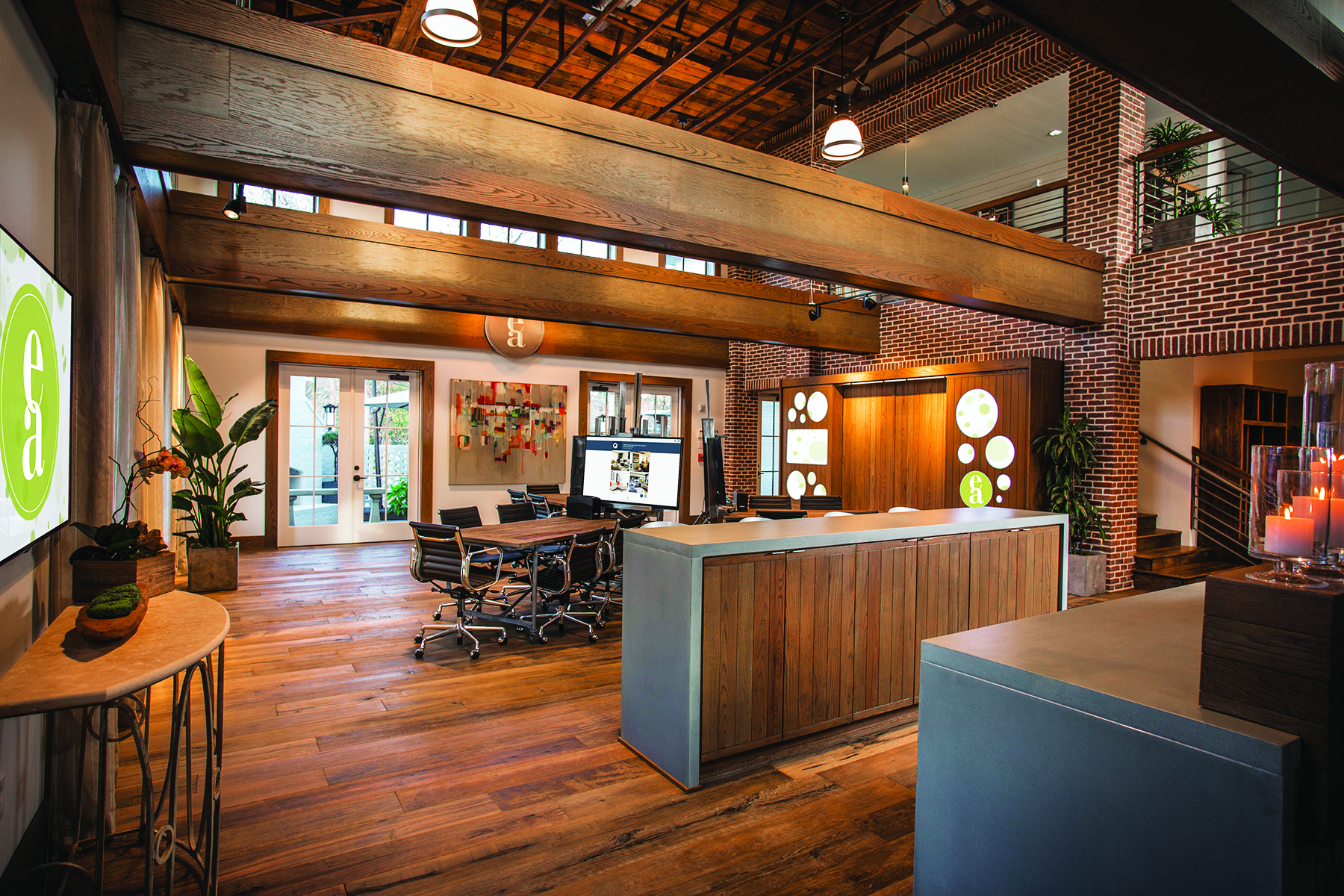
Sorting through a multitude of choices can be stressful for buyers, so Edward Andrews’ design center positions the builder as a reliable partner. (Photo: Aaron Bowdoin, 45 Studios)
Tech Support
For custom homebuyers, the design selection process can be overwhelming. Edward Andrews eases that burden from the get-go with a technology-driven experience that is approachable and in tune with buyers’ individual preferences.
Potential customers begin by completing a digital style quiz based on a matrix of algorithms and a lifestyle questionnaire. Using the results, Edward Andrews’ designers assemble selections that align with the buyer’s tastes, helping to narrow the number of options and ensuring they can more comfortably and confidently make decisions.

The design center is also beautiful to look at and naturally inviting, with a two-story ceiling and open beams soaring over rustic-elegant workstations. A neutral palette throughout ensures that the center itself doesn’t interfere with decision-making. Technology again comes into play in the form of flat screens for viewing floor plans, renderings, and imagery. A serving bar and an outdoor patio further both the experience and the lasting impression that Edward Andrews is a builder partner with which buyers can feel completely at ease.
BEST SOCIAL MEDIA CAMPAIGN: ART SHOPPE LOFTS

Instagram posts using the hashtag #artshoppe reveal the social success behind a partnership with designer Karl Lagerfeld.
Fashion Forward
When the aim is to make new condos hip, why not join forces with a famous fashion designer?
Art Shoppe Lofts + Condos had already set itself apart in Toronto’s crowded condo market with amenities and a nontraditional building form—a 28-story tower stepping down to a loft-style 12-story podium. The finishing touch: partnering with Karl Lagerfeld to design the building’s two lobbies. The collaboration kicked off with an elaborate event, an invitation-only soiree that marked the designer’s first-ever visit to Canada.
The team at Art Shoppe Lofts + Condos and its agency, Montana Steele Strategic Marketing, launched a widespread campaign across Facebook, Twitter, and Instagram. The team crafted a series of buzz-generating posts leading up to the event, including playing off of the project’s overall tagline “the art of __” (change/living/nature/connecting) as well as Lagerfeld’s own (often quirky) social media presence.
Social media lit up during the launch party. A hashtag, #lobbiesbykarl, tied the campaign together; in the final measure of social media success, it became a trending topic on Twitter. “Between our team creating content and engagement from guests and the general public who were following, there was a lot of excitement,” says Daniela DiStefano, digital marketing manager at Montana Steele. The impact lingered long after the champagne glasses were cleared away, helping position Art Shoppe Lofts + Condos as a trendsetter and boosting its reach with 1.5 million impressions, more than 1,000 tagged photos, and a 10 percent growth in Twitter followers.
BEST WEBSITE FOR A BUILDER: SCHUMACHER HOMES
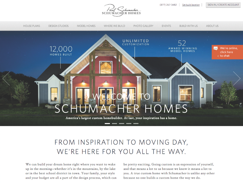
Schumacher’s website streamlines the online experience, using only information directly relevant to buyer decision-making.
Destination Inspiration
Custom builder Schumacher Homes prides itself on a new motto, “Your Inspiration Has a Home.” “It all starts with the customer and what’s important to them and their lifestyle and how their home reflects that,” says Mary Becker, vice president of sales and marketing for the Canton, Ohio-based builder. To bring the mantra to life online, Becker’s team set out to make Schumacher’s website a more useful customer tool for homebuying. The revamped site serves up information relevant to every step of the homebuying process. Those starting out can visit an extensive photo gallery, then create an account and start building inspiration boards where they can save images from the website or upload their own images.
The resulting site is easy to navigate. Multiple entry points offer design ideas, and built-in tools help organize options as customers visualize their dream home. The team intentionally implemented clear calls to action throughout, including a desktop chat option. “The biggest thing [we learned] is to keep the customer in mind,” Becker says. “What is their experience online and how can that translate to an in-person visit, and what are the tools they need every step of the way?” The efforts are paying off: Since relaunching the site last March, the builder has seen the number of sessions increase by 21 percent, unique users increase by 24 percent, and page views grow by 27 percent.
Advertisement
Related Stories

Sales + Marketing
7 Sales and Marketing Trends to Watch (and Learn From)
These award-winning campaigns from NAHB's 2024 National Sales and Marketing Awards showcase next-level strategies and stellar results
Forty Under 40
2024 Forty Under 40 Nomination Form
Help us recognize the rising stars, innovators, and game-changers in the housing industry!
Awards
6th Annual Most Valuable Product Awards
Drumroll ... Please join us in celebrating our 6th Annual MVP Awards winners, which represent the best in innovative building products

