Top 5 Tips from Award-Winning Websites
Key Takeaways
- Focus on understanding your target audience through research and tailored content to deliver relevant, inspiring messaging that resonates locally and nationally
- Design websites to be mobile-first, visually appealing, and easy to navigate
- Incorporate interactive tools such as style quizzes, virtual tours, and real-time customization options to empower buyers and facilitate decision-making

This article first appeared in the July/August issue of Pro Builder.
Builder websites have come a long way from the static brochure-style sites of the 1990s. Today, they offer user experiences that deliver clear messaging, stunning imagery, virtual walkthroughs, intuitive navigation, and easy ways to ask questions and get real-time responses, make an appointment, or even buy a home with just a few clicks.
Of course, not every home builder website embraces all of these technologies, but those on the cutting edge do enjoy a certain competitive advantage for attracting, nurturing, and converting prospects into buyers.
Winners of the Best Website by a Builder category of the 2024 National Sales & Marketing Awards (aka The Nationals), a longstanding annual recognition program produced by the National Association of Home Builders (NAHB), exemplify the perfect marriage of technology and respect for audience-focused content and functionality.
From those winners, we gathered their Top 5 tips and tricks for others to learn from and follow.
Be Customer Centric
“We designed our website to follow the way people actually search for a home,” says Char Kurihara, senior VP of sales and marketing for DRB Group , the Rockville, Md.-based parent company of DRB Homes, DRB Elevate, and now Brightland Homes, and #23 in Pro Builder’s 2025 Top 200 rankings. “At the same time, we wanted it to be flexible enough to meet individual user preferences and deliver information and online resources quickly, clearly, and efficiently.”
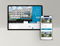
Kurihara emphasizes that there’s no single way people search for a new home, so the DRB Homes website was built to support many methods. For instance, the site offers multiple entry points for home shoppers to browse by state, region, city, or county, as well as by home type, community name, or availability.
“You have to meet buyers where they are, and that means giving them the ability to search on their terms, with the information they’re looking for right at their fingertips,” she says.
To further support buyers, DRB also integrated a multilingual chatbot named “Darby,” a nod to the company’s initials. Available 24/7 and fluent in over 100 languages, Darby is designed to assist users any time of day.
“About 65% of people are searching for homes after business hours,” says Kurihara. “They know they’re chatting with a bot, but even that level of transparency increases trust.” She adds that during working hours, human salespeople replace the bots to answer online questions.
Trust also drives DRB’s commitment to listing accuracy, particularly for quick move-in homes. Because the website is integrated with platforms like Zillow, Realtor.com, and NewHomeSource, maintaining accurate, up-to-date listings is essential to ensure buyers see consistent information across every channel.
“Nothing frustrates buyers more than falling in love with a home online, only to find it’s no longer available,” Kurihara says. “Content accuracy reflects on your brand. It shows respect for the buyer’s time and builds credibility.”

Understand Who Your Homebuyers Are
“Our website is built on three essential pillars: trust, inspiration and simplicity,” says Mitzi Hatori, chief marketing officer at AR Franchising, Inc., in St. Petersburg, Fla.
The company comprises over 40 individually owned and operated custom builders (franchisees) across nine states. AR Franchising is the franchisor of the AR Homes brand (#60 in the 2025 Top 200) and provides design services, interior design, purchasing, marketing, training and software to support their building companies.
While each franchisee builder has its own website, “The journey is the same—how the buyer gets to the homepage and where they go next,” Hatori says.” But the messaging and the photography is very specific for that local building company.”
As a luxury builder, AR Homes strives to be approachable. “The website is the digital face, and if you don’t capture buyers’ attention from the homepage, you’re going to lose them to the next builder,” she says.
To that end, the site has beautiful photography that draws viewers into the messaging. “Inspiration comes through the design,” Hatori adds.
While each franchise caters to a luxury buyer, every buyer is different in every market. AR Homes’ biggest website challenge,
Hatori says, is balancing the needs of a diverse multi-generational audience while maintaining a streamlined user experience.
“It’s about working closely with that builder to make sure that it’s not just the brand, but that their local story comes through.”
AR Homes also takes a deep dive into homebuyer research, rendering both qualitative and quantitative data. The company meets with its builders across specific regions and conducts interviews with their homebuyers, followed by a national digital survey that targets people who are either interested in buying a custom home or who have already purchased a custom home.
“We analyze the data, and listen to buyer feedback to update our website, ensuring our message resonates,” Hatori says. Recently, they’ve been targeting Gen X and Millennials. Based on their survey, most of their buyers have built homes before, but custom building is a whole different experience, she says.
“It’s not like production—it takes more time, more decisions, and a lot more personalization. That’s why we focus on giving them information they need to feel confident from the start.”
Buyers who fill out a web request form receive a homebuying guide, which sets the tone and gives them a clear starting point.
“Then it becomes a powerful tool for the salesperson to say, ‘Great—you’ve got the guide. Let me walk you through it in more detail.’ It’s a natural and helpful transition from the website to the salesperson,” she says.
RELATED:
- 5 Ways to Own Online Sales: Top Tips From Award-Winning Sales Pros
- Home Sales: A Buyer’s Perspective
- Achieving Better Website Conversions, Part 1: Sales Funnel Basics
Trust Transparency
There are five ingredients for a great builder website, says Richard Mariani, sales and marketing manager at CountryWide Homes in Toronto, Ont., Canada: user-friendly navigation; informative and engaging content that showcases the brand’s personality (read: full transparency about the product); interactive tools; clear contact information; and mobile friendly.
Those key elements, which earned CountryWide the Gold award from The Nationals, came through as the builder revamped its website over the past two years after spending several months analyzing, fine-tuning, and tweaking the data.
“This is our most important sales tool,” he says.
With a broad target audience of homebuyers, real estate agents, brokers, investors, and business partners, it was important for CountryWide to create a “User-centric hub that’s engaging and transparent,” Mariani says.
The transparency starts with offering prospective customers information about the entire homebuying journey—what happens before they buy a house, during the purchase and after.
“They can see finishes, space layouts, quality control checks, information on what happens at closing and what happens after,” Mariani says. “They can look at an available lot and find a home style that fits.”
In addition, CountryWide believes buyers should be educated and have all the assets they need at their fingertips. That includes blank agreement and purchase of sales forms.
“Customers can take it to their lawyer to go over in advance. If they have questions, we can answer those. It’s advantageous for the homebuyer,” he says. “People need to know what they’re going to get into.”
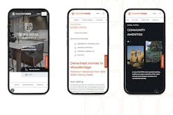
The company made the decision to focus on a single branded website, rather than microsites, to showcase their 17 active master-planned communities. High-quality photographs, videos, and 360-degree virtual tours bring their communities to life for users.
Visitors have a fully immersive and streamlined experience on a site that is easily navigated and has clear calls to action.
“We want to keep people on the website as long as possible,” and see everything the company has to offer in one place, adds Mariani. Microsites for each community, he says, “May leave a prospective buyer unaware that we have another product only two kilometers down the road.”
Use It as a Showcase
It’s absolutely by design that the website of GV&Co, a Toronto-based general contracting firm, is as clean and minimal as one might imagine for an architect.
“You have to know your buyer and speak to them,” says company co-founder and partner Paul Vouriot, who works with clients to find properties, architects, and designers, as well as to do the actual build. “We try to avoid showing the messy back story. We’re selling the finished projects. We wanted a website that showcases that.”
The site, which was redesigned and relaunched in 2024, is refined and elevated, offering an opportunity to feature past projects and educate potential customers about the company.
“There’s a sophistication in using a classic Swiss grid style [characterized by minimalist design, sans-serif typography, and asymmetrical layouts] with modern touches,” he says. “The style aligns with our mentality (to) focus on project photography.”
The site’s functionality is as simple as the style is minimal. It’s easy to navigate and easy to use on desktops, laptops, or smartphones.
Vouriot says they use the site as a portfolio. “People want to see what we’re doing. We are fortunate enough that our site isn’t for new business,” as the company has a full load of work for several years to come.
But he’s also quick to point out that the portfolio is not a static brochure. “Being able to click through it is important, seeing projects from different angles, and we’re currently working on a 3D walk-through function,” understanding that many people—even those in the industry— are not able to picture three-dimensional space.
GV&Co uploads images as quickly as they can on the website and posts two to three times a week on social media platforms like Tik Tok, Instagram, and Facebook, where they also show videos of work in progress.
Think Outside the Screen
Irvine, Calif.-based Tri Pointe Homes (#12 in the 2025 Top 200) builds premium single-family and attached homes across 12 states and Washington, D.C., with a strong focus on lifestyle, location, and design. The brand resonates with homebuyers who appreciate design and seek vibrant communities.
“Our homebuyers are thoughtful, design-minded people looking for a well-located community and a home that fits their lifestyle,” says Linda Mamet, executive VP and chief marketing officer. “The Tri Pointe Homes website speaks directly to them with tailored content, intuitive navigation, and tools that let them explore at their own pace.”
The website reinforces Tri Pointe’s premium identity with a clean, modern design, immersive visuals, and a mobile-first experience. Features like virtual tours, interactive floor plans, and rich community pages convert interest into action.
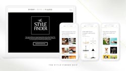
To deepen its emotional connection with prospective buyers, Tri Pointe Homes launched a first-of-its-kind collaboration with design expert and Emmy-winning TV host Bobby Berk.
The partnership resulted in a separate, independently branded site that serves as a design-focused discovery hub that inspires users and their imaginations. “It was nothing short of extraordinary,” Mamet says of the collaboration.
The Bobby Berk X Tri Pointe Homes collaborative website offers a distinctive, editorial-style experience focused on personal design exploration.
While visually and functionally different, it also intentionally guides visitors to Tri Pointe Homes’ main website once they’re ready to take the next step in their homebuying journey.
The online experience delivers an editorial-style, interactive journey through a variety of content, including:
- Videos introducing Bobby Berk and 10 unique design collections created exclusively for Tri Pointe Homes
- Curated style explorations, from flooring to furniture and fixtures
- A “Style Finder Quiz” to discover the user’s personal design preferences
- A “Get the Look” feature enabling real-time purchases inspired by Berk’s aesthetics
The platform enables, encourages, and empowers users to define their design tastes before they begin shopping for a new home. Seamless calls to action then prompt users to visit the Tri Pointe site, where they can continue their journey through virtual tours and interactive floor plans, location-based home searches, mobile-optimized community pages, and lead forms designed for sales conversion.
About the Author

Stacey Freed
Stacey Freed, a freelance writer based in Rochester, N.Y., covers design and building.